Get Closer to Your Data: Seven Steps You Need to Follow
The Rise of the Data-Smith
In the Middle Ages, blacksmiths and coppersmiths produced beautiful works based on the knowledge of their materials: how the materials behaved, what different qualities they had, what the melting points were, etc. For modern data-smiths (engineers, DevOps and developers), an intimate knowledge of their primary working material – data – is necessary.
When immersed in a new data-rich environment, one of the first challenges for today’s data-smith is getting close to the data. In this situation, I find it useful to follow seven steps, a framework first proposed by Benjamin Fry. I presented this material last week at the Data Science Projects Group of the Hacker Dojo, and it generated a lot of head nods and discussion.
Follow these seven steps to get closer to your data today:
Step 1: Acquire
Data-rich environments usually have very diverse data sources, so acquiring data is almost always a challenge. Models may reveal insights only by combining features available from diverse origins. It is useful if there are already rich points of aggregation for data coming from all sorts of computing devices: servers, networking equipment, industrial equipment and Internet of Things (IoT) appliances.
It is very important to have contact with the people who control the data production process, if possible. For instance, if you are modeling and analyzing a complex system, being closely in touch with the developers who created the architecture, applications and their logs is crucial. As you enhance your knowledge of the system, ideas for capturing new variables will inevitably come up, leading to a more refined understanding of how the system works.
Step 2: Parse
Parsing helps us get important elements out of data sources and classify them into categories for further analysis, according to a set of rules. If you are parsing machine-generated data, in many cases, data will be unstructured. If Loggly is one of your sources, one key advantage is that it already parses a wide variety of formats. Other data you may want to include in your analysis can come in an almost unimaginable diverse set of formats. If so, it is helpful to use regular expressions to parse the information. If you experience immediate disgust at this idea, you are not alone – however, using regular expressions is one of the most useful elements in the analytical toolkit.
Step 3: Filter
Truth is, not all data is useful – for different reasons. Some data is too granular, so an aggregation, or a representative sample, captures the essence of the behavior that one needs to understand. For example, if you want to understand what drives conversions at a highly trafficked web site, you may not need all the details for every single person in the vast majority who did not convert – a sample will often help get you acquainted with the data. It is also important to understand the meaning of missing values and zeroes. If the value is missing, ask yourself: is the value missing because it represents a zero or because data was not available? Conversely, is the zero value in the data really representing a missing value? Different answers to these questions can lead to quite different insights derived from the data. In some cases it is also important to remove some outliers. For example, if you are collecting response times for a web service, timeouts in the network may generate disproportionately high values depending on how the data is logged.
Step 4: Mine
Mining is the art of finding gold in a pile of dirt. In the world of data, this involves many techniques, a couple if which I will discuss here: calculating new features from existing ones, and applying concepts from descriptive statistics. For example, suppose that you run a website that provides information that users can search and you want to know how much time a user typically waits before performing a new search (this might be useful to understand end-user engagement). To find how much time elapsed, you would create a measure based on the original data set that tracks how many seconds elapse between two non-identical queries by the same user. Alternatively, you may want to understand the causes of long query times, in which case it is useful to focus on the subset of data for the slowest 5% of queries, or 95th percentile. It is important, however, not to assume that data will always fit well known distributions such as the normal or pareto curves – Internet-based metrics often have long tails. In his 1996 paper “Goodbye Pareto Principle, Hello Long Tail: The Effect of Search Costs on the Concentration of Product Sales”, MIT professor Erik Brynjolfsson shows that given the lower search costs, Internet purchases of goods show less concentration than similar purchases at retail stores, even when both have the same inventory. This means that the frequency distributions for online purchase have longer tails, due to the fact that the Internet lowers search costs. When people can search more easily, they are more likely to make more tailored, individualized choices.
Step 5: Represent
Basic statistics and simple models can miss important qualities of the data. The statistician Francis Ascombe suggested that it is easy to pay too little attention to graphs. He declared that many statisticians in his time were indoctrinated with three wrong ideas:
- Numerical calculations are exact, but graphs are rough
- For any data set, there is one correct numerical analysis
- Performing calculations is virtuous, whereas looking at data is cheating
Instead, he illustrated the need for data visualization by using four datasets with almost identical statistical properties, as summarized in the following table:
|
Property |
Value |
|
Mean of x in each case |
9 (exact) |
|
Sample varianceof x in each case |
11 (exact) |
|
Mean of y in each case |
7.50 (to 2 decimal places) |
|
Sample variance of y in each case |
4.122 or 4.127 (to 3 decimal places) |
|
Correlation between x and y in each case |
0.816 (to 3 decimal places) |
|
Linear regressionline in each case |
y= 3.00 + 0.500x(to 2 and 3 decimal places, respectively) |
Source: Anscombe, F. J.(1973). “Graphs in Statistical Analysis”
Anscombe then showed how each of the four data sets can appear very differently when graphed:
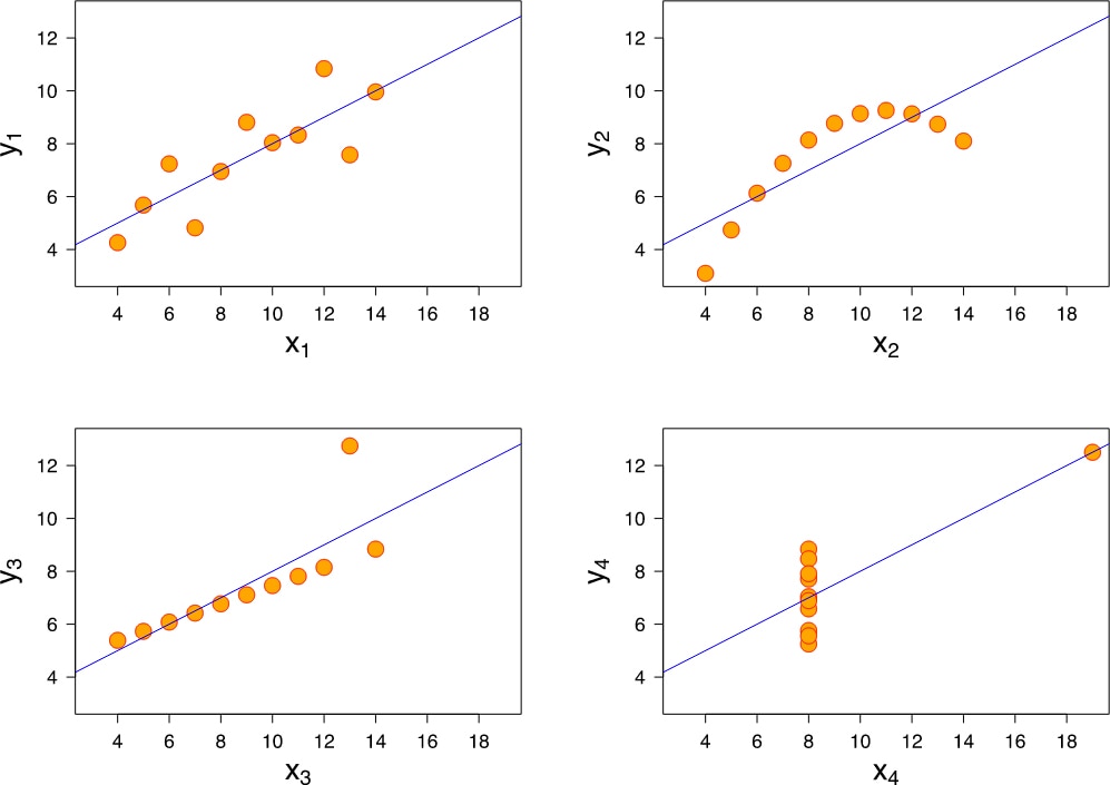
Source: Wikipedia
Step 6: Refine
Visualizations are meant to be shared, so it is important to get feedback from people who have close knowledge about key aspects of the business. More often than not, this leads to refining the whole process: acquiring, parsing and filtering more data, or mining what you already have to extract more features. Oftentimes, as you get user feedback, it may be necessary refine your visualizations to enhance their clarity. If this is the case, it is worth keeping in mind well-accepted design principles from Edward Tufte’s work:
- Focus on content (“above all else, show the data”)
- Avoid mere descriptions (show data “compared to what?”)
- Maintain integrity of content (have good labeling, show data variation and not design variation)
- Display with quality (use high resolution graphics)
- Use beautiful, classic designs
Refining is an art and it is too easy to get immersed in it, so it is necessary to understand that there are diminishing returns to time spent — at some time, we need to move on to the next problem!
Step 7: Interact
Sharing datasets, visualizations and models with colleagues helps ignite more questions and fosters a challenging analytical environment within the organization. An open analytical culture is crucial for the advancement of knowledge at all levels of society. Consider, for example, the current situation in parts of the academic world. News organizations affirm the report that many trusted scientific results are not replicable, and include situations that are hard to spot or correct as researchers often do not share their data (The Economist “Unreliable Research: Trouble at the Lab”, Oct. 19, 2013).
It is important to share the results of your analytical work, the sources of your data sets and the data itself. Sharing is essential for generating credibility, and it also creates a sense of co-responsibility in ensuring that knowledge is advanced through sound analytics.
Putting it All Together
The Industrial Revolution lead to high degrees of specialization, but the modern data-smith is more of a medieval character – learning through apprenticeship and mastering the different processes that affect the raw material of his trade: data.
The Loggly and SolarWinds trademarks, service marks, and logos are the exclusive property of SolarWinds Worldwide, LLC or its affiliates. All other trademarks are the property of their respective owners.

Mauricio Roman


