Visualizing Your Data with Python and Loggly
Loggly’s Dashboard feature shows important metrics for operations and also for business when sent from Python and other tools. This puts important information from your application right at your fingertips and allows you to combine log analysis, error reporting, statistics, and also business information into a single system.
Visualizing helps in understanding data
Logs are often used to understand problems once they occur, or to notify administrators and other stakeholders of problems as they occur. But they can also be used to identify interesting system trends and understand overall system behavior, and with that even uncover problems before they occur or become disruptive.
Analyzing memory usage or average response times for a web request can reveal a gradual increase over time, allowing you to preemptively mitigate the issue before it affects a wide set of users. Such preventive log analysis can be as important as the post-fact analysis.
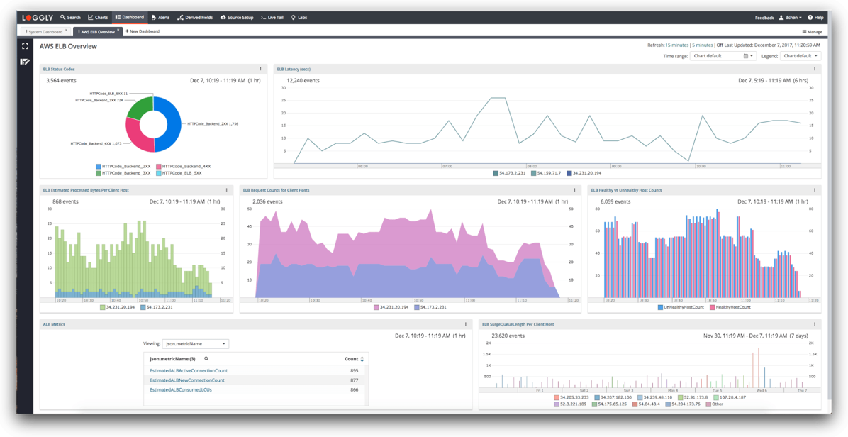
Understanding such trends requires analyzing long-term developments of log data, which is easier to do through a visual representation. Loggly’s Charts feature allows you to create charts and visualize data easily. You can create charts and add them to dashboards, which can be easily shared with the rest of your team using email, HipChat, Slack, and other collaboration tools.
Getting data into Loggly is easy
Loggly provides multiple ways of sending log data. If you are already using Loggly for your logs you can just continue using whichever method you use. For example, if you send your logs to standard output and let Docker or systemd handle the rest, you should do the same with log messages you generate for your dashboards. If you just want to test these ideas, or if you want to use a different Loggly endpoint, you can also use the HTTP API directly from Python. Using the requests module, this is very simple:
import requests

requests.post(LOGGLY_URL, json={
    "timestamp": "2017-11-19T20:00:00.00Z",
    "temperature": 23.5,
})
This assumes that you set the LOGGLY_URL variable to the HTTP input endpoint.
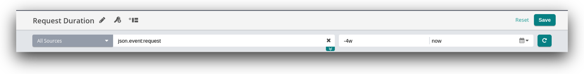
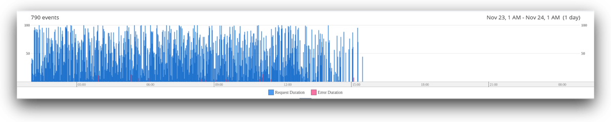
Request duration
Using a simple middleware, you can log request duration for Django requests. The code below also includes the request status so that error messages and redirects do not skew the overview over normal requests. This could also include the request path here to make it easy to show different graphs per path.
The logging code is rather simple:
requests.post(LOGGLY_URL, json={
    "timestamp": timestamp.strftime("%Y-%m-%dT%H:%M:%S.%fZ"),
    "event": "request",
    "status": status,
    "duration": duration
})
The event field makes it easy to restrict the dashboard view to this specific event. When creating a chart in Loggly, we use this name to select only the events we are interested in. The chart settings here then show the development over the last four weeks, but what time frame makes sense for you depends on your particular use case.
Once we only see the events we care about, we can then customize the chart the way we want. In this particular example, we create a Column chart for request duration, using different column colors for successful requests (status 200) and errors (status 500).
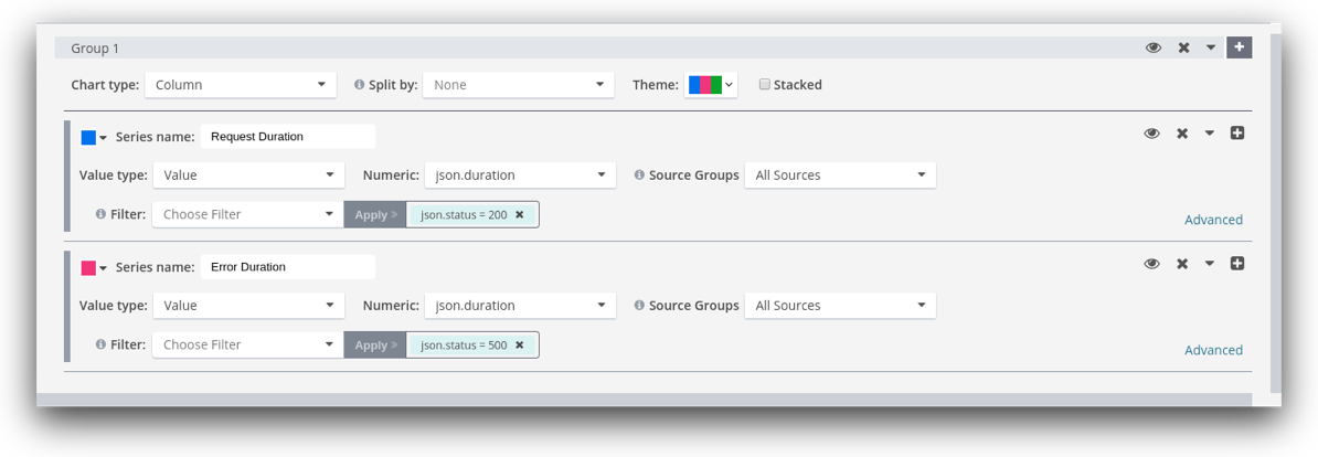
The resulting graph gives a good overview of the various request durations. If at some point, request duration changes regularly from the norm, we will see this immediately in this graph. Also, an increase in error responses will be noticeable as an increase in red bars in the graph.
Number of users
But you are not limited to operational system data. It’s quite possible to include business metrics into dashboards, for example for product management and customer success. These metrics enable these users to understand how well the product is performing, how existing features are used, and which features to prioritize over others in the future.
Using Loggly Dashboards, you can simply create different dashboards for operations and for product owners, showing just the relevant information for either target audience. This has the added bonus that you can use the same infrastructure for logging, operations metrics, and business metrics, without having to create and maintain new infrastructure for all of them.
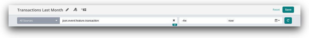
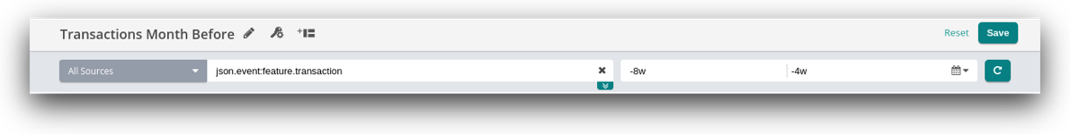
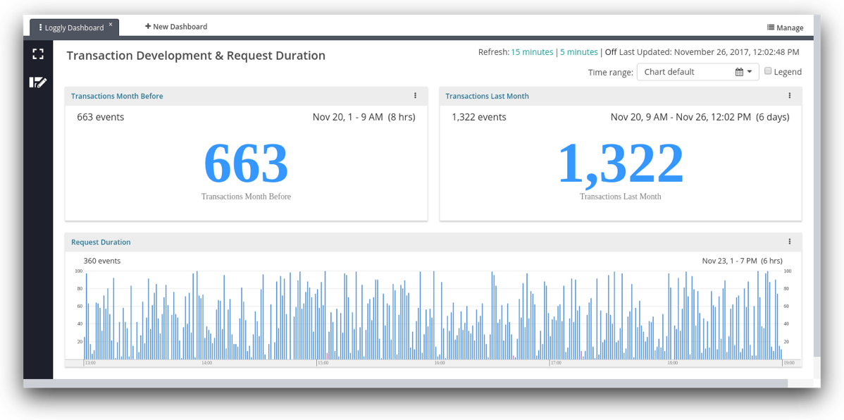
Let’s say the development team has added a new feature and the product owner wants to see how well it is used. Ideally, this should show two numbers: “uses this month” and “uses the month before.”
To do this, we can simply emit a log event every time the feature is used. Loggly Charts can count the number of uses in a given time frame. We then create two charts to count the events in the last four weeks and then the four weeks before that. We then can easily place those side by side on a dashboard.
Emitting the log event is very simple, though I would like to stress that you should use your existing logging infrastructure to avoid accidentally blocking your application for this HTTP request.
requests.post(LOGGLY_URL, json={
    "timestamp": timestamp.strftime("%Y-%m-%dT%H:%M:%S.%fZ"),
    "event": "feature.transaction"
})
Here, you can see one way of naming your events to make it easier to namespace them and find unique names for each. Using these names, it is easy to select the relevant events in the chart. We create two chart, one for the events in the last month and one for the events in the month before that. This is easy using Loggly’s time syntax, using -4w and -8w for “4 weeks ago” and “8 weeks ago,” respectively.
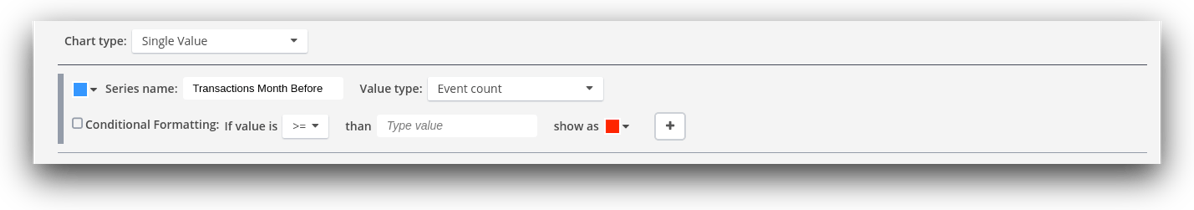
The chart for this business metric is a single value and easily configured the same way in both charts.
Finally, we can add all three charts to a new dashboard and arrange them in an easily digestible way. This dashboard can now be shown in the entrance of the office so that everyone can easily understand how the Python-based application is doing.
Summary
Loggly’s dashboarding and charting features make it easy to visualize important data from your applications and business metrics in one single pane of glass for monitoring and planning Start sending data to Loggly via Python today! Just click this link for a free 14-day trial.
The Loggly and SolarWinds trademarks, service marks, and logos are the exclusive property of SolarWinds Worldwide, LLC or its affiliates. All other trademarks are the property of their respective owners.

Jorgen Schäfer Jorgen is a software developer with more than ten years of experience in both application development and system administration. As a part-time freelancer, he writes technical articles, gives public talks, and provides training services.